Web Writing Mistakes That Drive Visitors Away
Your web site is the most powerful and far-reaching communications vehicle you have. Are you driving visitors away with poorly-written web copy? Here are 3 surefire signs your web copy sucks:
1. It’s All about You, You, You
We love to talk about ourselves. Bizarrely, nobody likes to listen to us talk about ourselves. In fact, it’s one of the best ways to scare people off, online or in person.
If most paragraphs or sentences on your site start with “I” or “we” well, then, chances are good you’re making this deadly mistake.
Engage your visitor by focusing on them: their hopes, dreams, aspirations, fears, and needs. Demonstrate how you can help. Then stop.
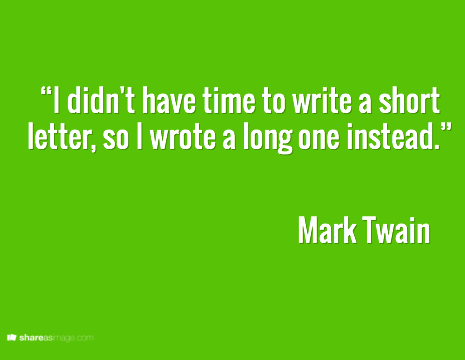
2. Your Web Copy Goes On FOREVER
Clarity takes time. Your web site — that calling card to the world — is no place to rush.
Take the time to do the hard work of figuring out what matters. Leave the rest out. Know that you are making the world a better place for somebody on some screen somewhere.
3. It’s Packed with Insider Jargon
It’s hard to remember, when you’re deep in the trenches, that your web visitors may have no context for what you’re saying. This may be the first time they’ve ever thought about roof repair, college admissions, or how a particular policy applies to their situation.
Be gentle. Use simple words and plain language. Watch for the assumptions you’re making. And remember to invite your web visitors in rather than pushing them away.
